There are several steps in the process of branding
Step 1: Xploration
Through thorough conversations with the client, Sidekick unveiled the essence of the services and corporate culture at Pebble. Based on this, an in-depth analysis of the company, market and target audience was made.
Step 2: Name
Brainstorming, brainstorming and more brainstorming. And from this, the name ‘Pebble’ followed: a guiding pebble in the mountains – the perfect symbol for a company that guides you through the world of email marketing automation.
Step 3: Visual identity
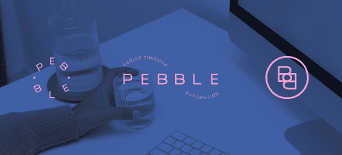
Sidekick created the logo design and chose specific colours to give the brand the right look and feel.
A calm, typographic logo with a dynamic swirl to symbolise the guided journey. The swirl also represents constant movement and innovation. The blue and pink colours are cheerful and radiate positivity and energy. And to maintain calmness and balance, plenty of white space was used.
Step 4: Brand guide
Pebble has a guideline for all future visual communication, thanks to a comprehensive corporate identity guide with all the information concerning the logo, colours, typography, …
Step 5: Website
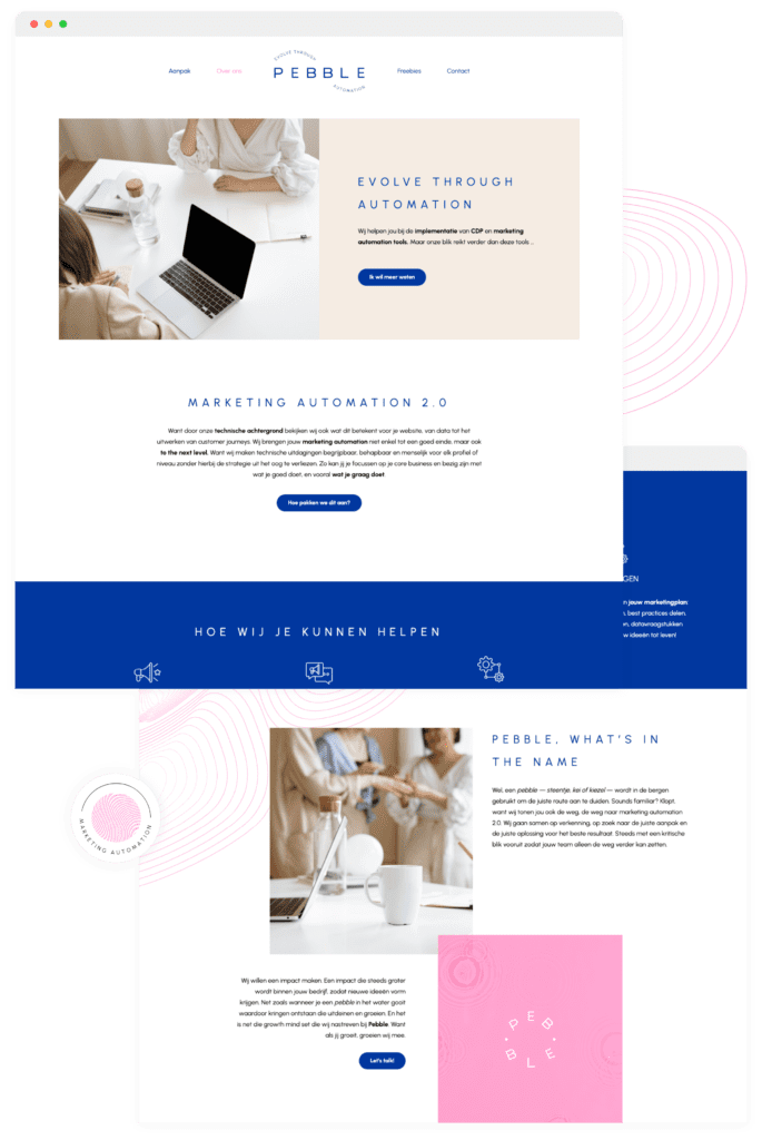
And lastly, a user-friendly website was created to provide possible customers with all necessary information.

Xploration
An emerging player needed a partner to develop its visual identity and accompanying website. Competence center Sidekick to the rescue!
Our solution
Sidekick helped brainstorm a name and worked on a strong visual identity that aligns with what the brand does.
Result
Sidekick worked on a logo, the typography and colour choices and a complete corporate identity guide. They also created the website. In all elements, including the name, you recognize the calm and guiding character of ‘Pebble’.
